NYC Taxi Analytics: Medallion Data Pipeline
A complete medallion-style analytics pipeline for NYC taxi trips, built from Bronze, Silver, Gold, and EDA notebooks and delivered through a Power BI report for operational insight.

Project Overview
This project transforms raw NYC taxi trip files into a curated analytics model through a classic medallion pipeline. The Bronze notebook ingests monthly parquet files from the NYC Open Data API, the Silver notebook validates and enriches the rows, the Gold notebook aggregates the data into business-friendly tables, and the EDA notebook validates the outputs and explores trip demand patterns before the Power BI report turns the pipeline into actionable insight.
Challenge
Raw taxi trip data is high-volume and noisy. The main challenge was to convert operational records into business-ready insights while keeping data quality high, preserving refresh reliability, and enabling non-technical users to explore trends such as daily demand, hourly peaks, and revenue behavior.
Bronze to Silver
Raw taxi files are downloaded, profiled, filtered to 2019, and cleaned for invalid dates, passengers, fares, and distances.
Silver to Gold
The cleansed dataset is shaped into daily, hourly, and zone-level aggregates for reporting and analysis.
EDA and Validation
Notebook checks verify row counts and trends, then compare demand patterns across dates, hours, and pickup zones.
Consumption Layer
The final Power BI report surfaces the pipeline as a business dashboard for trend exploration and decision support.
Data Flow (End-to-End)
1. Ingestion Layer
The Bronze notebook uses Python requests inside Fabric/Spark runtime to download monthly 2019 yellow taxi parquet files from the NYC Open Data source. Files are landed into the raw zone and persisted as bronze_nyc_taxi_trips.
2. Validation & Cleansing Layer
The Silver notebook applies quality rules: valid pickup/dropoff sequence, positive trip distance, and non-negative fare/total amounts. It also derives trip duration and temporal features (pickup hour, day, month) for analysis.
3. Aggregation Layer
The Gold notebook builds analytical marts for consumption: daily metrics, hourly demand, and zone-level performance. This decouples heavy transformation from reporting and improves dashboard performance.
4. Analytical Validation Layer
The EDA notebook validates business behavior in the curated tables, checks trend consistency, and confirms that metrics are decision-ready before visualization publishing.
5. BI Consumption Layer
Power BI consumes the Gold outputs to deliver KPI cards and trend visuals for total trips, total revenue, average fare, hourly demand, and date-based movement.
Medallion Workflow
Bronze Notebook
Downloads the 2019 yellow taxi parquet files, checks schema and volume, and writes the raw table.
- bronze_nyc_taxi_trips
- Raw landing zone
- Source: NYC Open Data API
Silver Notebook
Filters bad records, keeps 2019 trips only, and adds trip duration plus time-based features.
- silver_nyc_taxi_trips
- Trip duration minutes
- Pickup hour, day, month
Gold Notebook
Creates curated analytics tables for daily, hourly, and zone-level reporting.
- gold_daily_trips
- gold_hourly_demand
- gold_zone_metrics
EDA Notebook
Explores trends from the curated tables and checks the reporting layer before dashboard delivery.
- Daily trip trend
- Hourly demand shape
- Top pickup zones
Data Pipeline Architecture
Source data moves from ingestion into Bronze, Silver, and Gold layers before reaching Power BI and exploratory analysis.
Notebook Outputs
Bronze Notebook Output
- Raw rows loaded into bronze_nyc_taxi_trips
- Schema and timestamp range validated
- Invalid passenger, fare, and distance checks
Silver Notebook Output
- Filtered to 2019 and positive trip durations
- Derived pickup_hour, pickup_day, and pickup_month
- Wrote cleaned silver_nyc_taxi_trips table
Gold Notebook Output
- Daily trip, revenue, and average fare metrics
- Hourly demand and zone performance tables
- Ready for semantic modeling in Power BI
EDA Notebook Output
- Trend checks for trip volume and revenue
- Hourly demand analysis across all 24 hours
- Pickup zone comparison for operational planning
Power BI Dashboard Preview
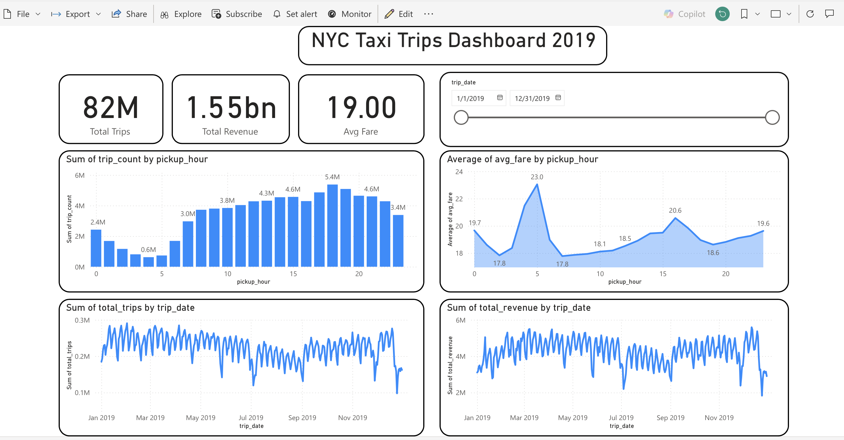
Dashboard snapshot with KPI cards (82M trips, 1.55bn revenue, 19.00 avg fare), hourly demand and fare behavior, plus daily trip and revenue trends.
Technical Stack Used
Data Engineering
- Microsoft Fabric Notebook
- PySpark DataFrames
- Delta tables (Bronze/Silver/Gold)
Processing & Modeling
- SQL and Spark transformations
- Feature engineering on timestamps
- Curated marts for BI consumption
Analytics & Validation
- EDA notebook checks on trends
- Demand and revenue sanity checks
- Zone-level demand prioritization
Visualization Layer
- Power BI dashboard design
- KPI cards and trend visuals
- Time filters and interactive slicing
Need this project or need this type of service?
Get in touch if you want a similar medallion pipeline, Power BI report, or end-to-end data engineering solution.
Get in touch