HealthCare (Pandemic Tracking) Dashboard
Real-time interactive dashboard tracking confirmed cases, deaths, and recovered patients across countries and regions with temporal trend analysis
Project Overview
Developed a comprehensive pandemic tracking dashboard using Power BI to monitor the global spread of the virus. This real-time analytics solution tracks confirmed cases, death rates, and recovered patients across multiple countries and regions, providing critical insights for public health officials, policymakers, and researchers to make informed decisions during the pandemic.
Business Challenge
During a global pandemic, timely and accurate data is crucial for effective response. Public health organizations needed a unified platform to track the spread of COVID-19 across different geographical regions, monitor mortality and recovery rates, identify hotspots, understand transmission patterns, and assess the effectiveness of interventions. This dashboard consolidates pandemic data from multiple sources into a single, interactive visualization that enables stakeholders to quickly identify trends, compare regional outcomes, and allocate resources effectively to areas most in need.
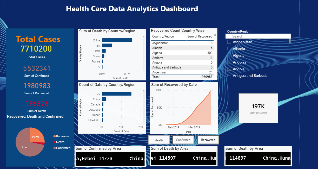
Pandemic tracking dashboard with real-time KPIs for confirmed cases, deaths, recoveries, and geographic trends
Technical Approach
Data Integration & Modeling
Built a comprehensive pandemic tracking data model integrating multiple data sources:
- Confirmed Cases Data: Total confirmed cases by country, region, and date with cumulative and daily new case tracking
- Death Statistics: Death counts, mortality rates, and case fatality ratios (CFR) across different geographical regions and time periods
- Recovery Data: Recovered patient counts, recovery rates, and active case calculations for understanding disease progression
- Geographic Dimensions: Country, state/province, continent hierarchies enabling drill-down analysis from global to local levels
- Temporal Data: Date tables with day, week, month, quarter, and year hierarchies for comprehensive time-series analysis
- Population Data: Population figures by region for calculating per capita metrics and infection rates
- Implemented star schema with fact tables for daily COVID statistics and dimension tables for geography, date, and demographics
Advanced DAX Calculations
Developed sophisticated measures for pandemic analytics:
- Case Metrics: Total confirmed cases, daily new cases, 7-day rolling averages, cumulative cases, and case growth rates
- Mortality Analytics: Total deaths, daily deaths, case fatality rate (CFR), deaths per million population, and mortality trends
- Recovery Tracking: Total recovered patients, recovery rate percentages, active cases (confirmed - deaths - recovered), and recovery time analysis
- Rate Calculations: Infection rate per 100K population, mortality rate, recovery rate, and active case percentage
- Comparative Metrics: Country-wise comparisons, regional benchmarking, percentile rankings, and deviation from averages
- Time Intelligence: Week-over-week changes, month-over-month growth, peak detection, doubling time calculations, and trend forecasting
- KPI Indicators: Trend arrows showing increase/decrease in cases, deaths, and recoveries with color-coded alerts for hotspots
Interactive Visualizations
Designed pandemic-specific visual components for real-time monitoring:
- KPI Summary Cards: Large cards displaying total confirmed cases, total deaths, total recovered, active cases, and case fatality rate with trend indicators
- Geographic Maps: Filled map visualizations showing case density by country/region with color gradients indicating severity levels
- Time Series Charts: Line charts tracking daily confirmed cases, deaths, and recoveries over time with multiple series comparison
- Trend Analysis: Area charts showing cumulative cases, deaths, and recoveries with forecast lines for predictive insights
- Regional Comparisons: Bar charts ranking countries by case counts, death tolls, and recovery numbers for easy benchmarking
- Recovery Rate Gauges: Radial gauges showing recovery percentages and CFR with target thresholds and color-coded zones
- Daily Statistics Tables: Matrix visuals displaying detailed daily statistics by country with sortable columns and conditional formatting
- Interactive Filters: Date range slicers, country/region filters, metric type selectors enabling custom analysis and exploration
Technologies Used
Need Healthcare Analytics Solutions?
Let's discuss how we can transform your healthcare data into actionable insights for better patient care and operational excellence.